
One of our most satisfying recent projects wasn’t a luxury penthouse or a high budget commercial space. It was a compact office renovation for a boutique design agency, where the challenge was clear from day one: achieve maximum visual impact with minimum spend, knowing that the space was temporary.
Rather than investing in major construction or expensive custom interventions, we focused on the elements that could fundamentally change how the space felt and functioned: layout, materiality, lighting, and detail.
Starting With the Existing Space
The agency wanted their workspace to feel like theirs: creative, focused, and distinctly studio like. The existing office, however, felt more residential than professional. The layout lacked a clear spatial hierarchy, the atmosphere was uninspiring, and the space did not fully support the way the team worked.
Because the budget was limited and no major structural changes were possible, the approach had to be strategic. Instead of trying to transform everything, we identified the interventions that would have the greatest impact.
A New Layout Using What Was Already There
One of the simplest but most effective changes was reorganizing the existing furniture.
The working tables were kept rather than replaced, but repositioned and regrouped to create a better balance between collaboration and individual focus. A new floor plan helped establish clearer circulation and a stronger sense of hierarchy within the relatively compact space.
The result was a useful reminder that improving a space does not always require new furniture. Sometimes, the same elements can create a completely different experience simply by being arranged differently.
Changing the Atmosphere Through Materials
Once the layout was resolved, we focused on changing the character of the interior.
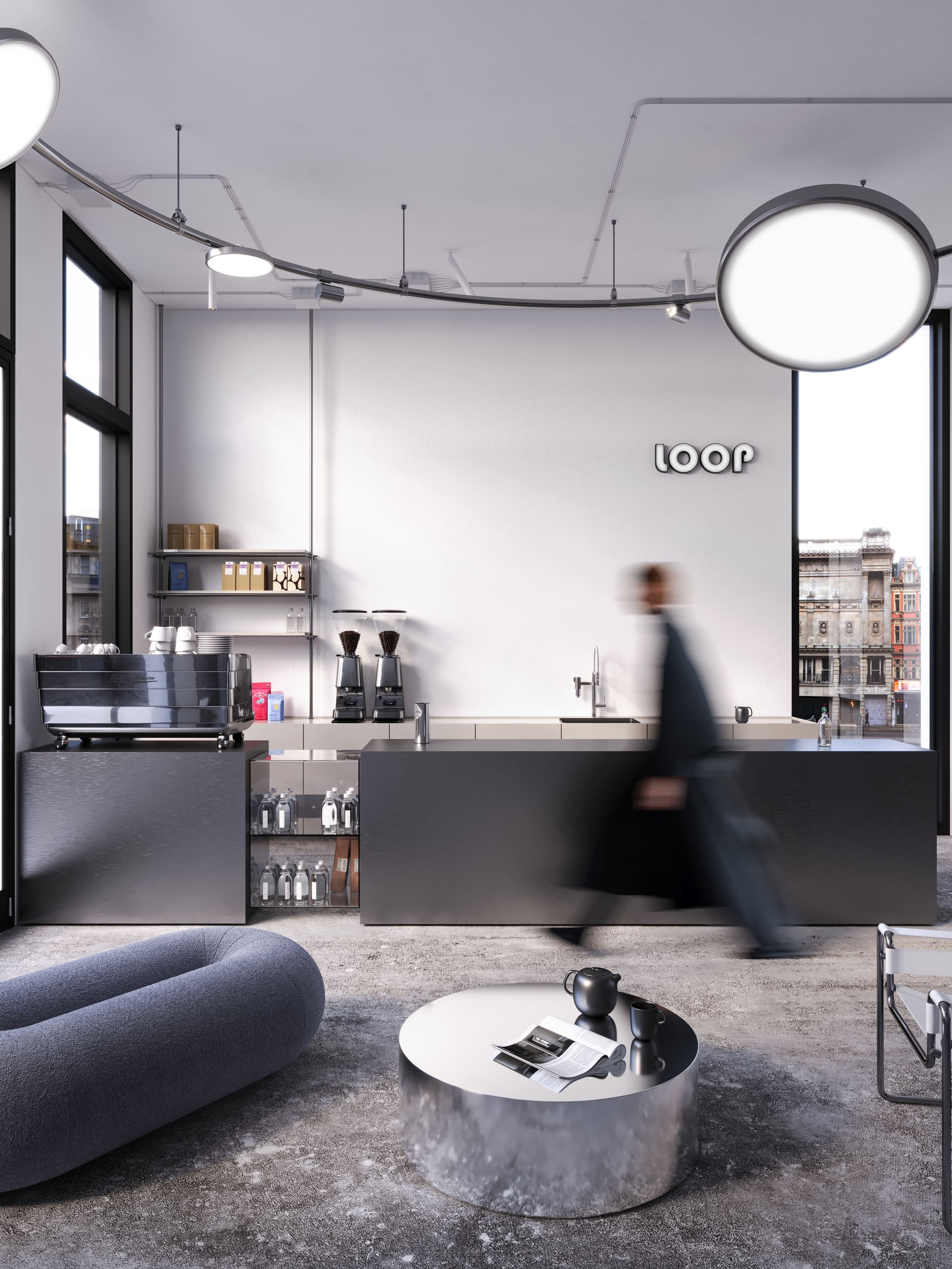
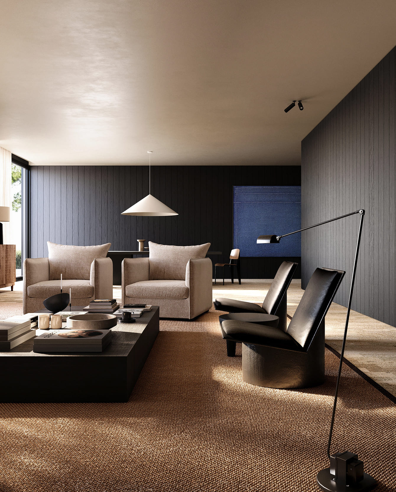
Inox finish wall panels were introduced on selected walls, bringing an industrial and reflective quality to the space while immediately giving it a more contemporary, studio like identity. Matte black was used on accent walls to further shift the atmosphere away from the residential character of the existing office and toward something more graphic and editorial.
Another relatively simple intervention made a surprisingly significant difference: carpet.
Installed throughout the office, the carpet adds visual warmth while also improving acoustics and making the space feel considerably more comfortable. It is one of those elements that can easily be overlooked when thinking about office design, but its impact on the overall atmosphere is substantial.
Building Layers of Light
Lighting became another important tool for transforming the space.
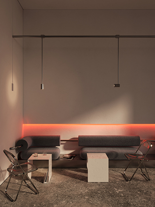
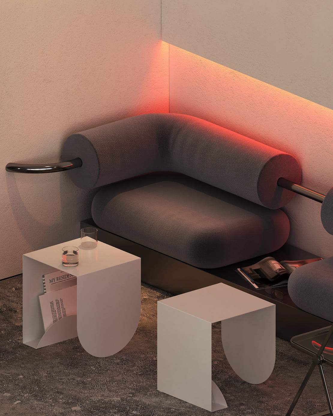
A new ceiling track lighting system provides a more flexible and functional source of general illumination, while warm LED strips were integrated behind the wall paneling to introduce a softer ambient glow. Table lamps were then added throughout the office to create smaller pockets of light and soften the contrast created by the darker materials.
Rather than relying on a single uniform lighting solution, the space now has multiple layers of illumination that can change the atmosphere throughout the day.
Bringing Life Into a Darker Interior
With the darker material palette, greenery became an important counterpoint.
Plants were introduced throughout the office as an affordable way to bring life, texture, and visual softness into the predominantly dark interior. Beyond their practical benefits, they help balance the harder surfaces and industrial character of the materials, making the workspace feel more natural and inviting.
Hiding What Didn’t Need to Be Seen
Not every part of the existing space could be redesigned.
The kitchen area was poorly integrated into the original layout, but structurally changing it wasn’t an option. Instead of treating this as a limitation, we looked for a simple way to visually separate it from the main studio.
A floor to ceiling drapery curtain became the solution. When closed, it completely conceals the kitchen and creates a cleaner visual backdrop for the workspace. At the same time, the curtain introduces another layer of texture and softness into an otherwise hard material palette.
It is a small intervention, but one that demonstrates an important principle of working within constraints: you do not always have to change something to improve it. You can simply change how it is experienced.
The Detail We Love Most
Perhaps our favourite element in the entire project is also one of the simplest.
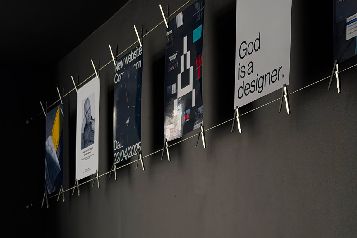
The black accent wall in the main studio features two tensioned metal cables running horizontally across its surface. They provide a flexible system for displaying the agency’s posters, mood boards, references, and inspiration.
The installation is inexpensive, minimal, and completely adaptable. More importantly, it allows the wall to constantly evolve with the people using the space.
Instead of creating a finished composition that remains unchanged, we wanted to create something that could respond to the agency’s creative output in real time. A living wall that reflects the work, ideas, and visual language of the studio.
Designing With Constraints
This project was a good reminder that thoughtful design is not necessarily about how much you can add. Sometimes, it is about knowing where to intervene and where not to.
With a limited budget, an existing furniture inventory, and the knowledge that the office is temporary, every decision had to justify itself. Rather than spending on elements that would not provide long term value, we concentrated on spatial organization, atmosphere, material contrast, lighting, and a handful of carefully considered details.
The project is currently in its final stages of execution, with full photography coming soon.
Follow along as we share the finished space.